Graphics and visualization
2026-01-12
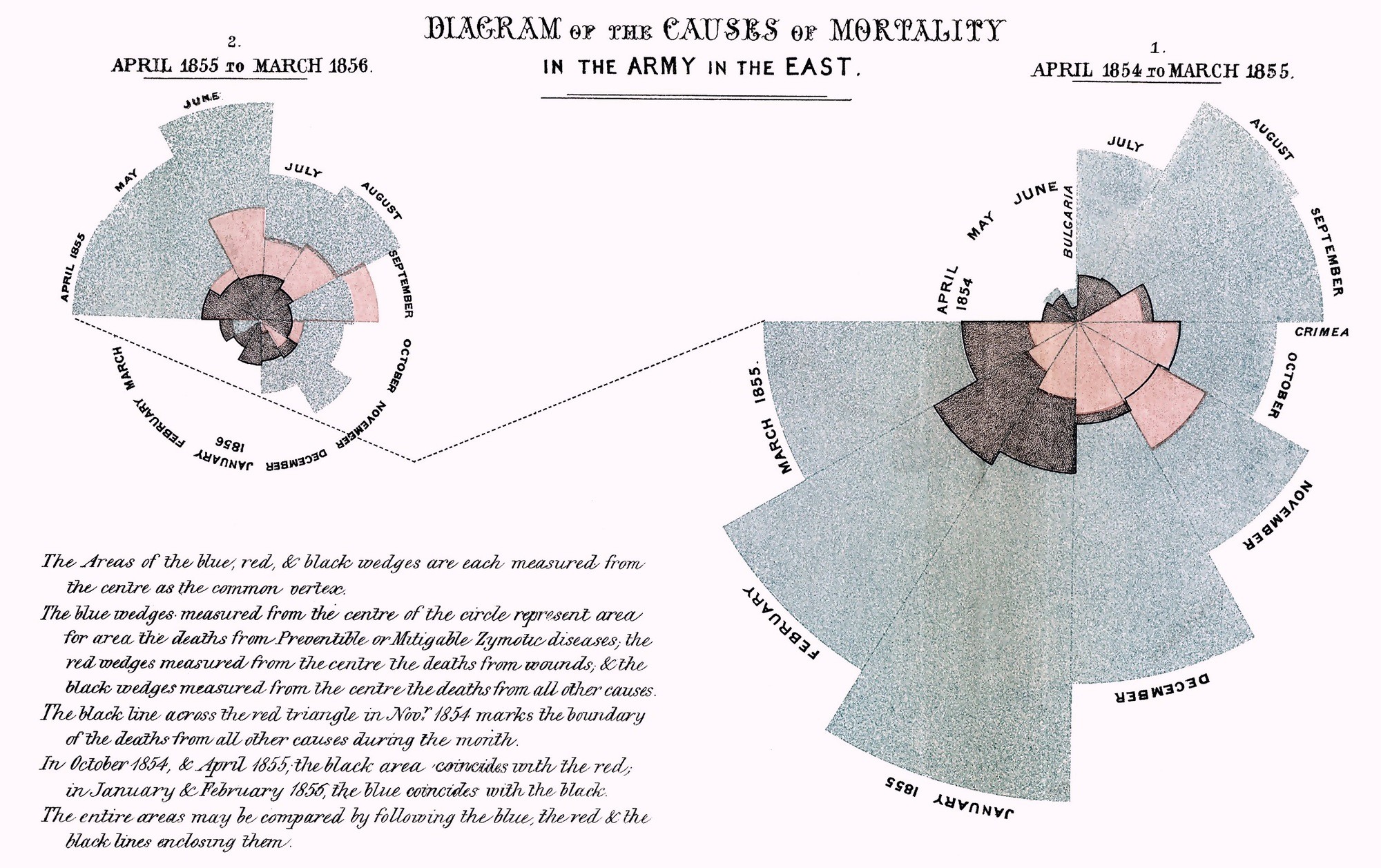
Above all else show the data.
Tufte 1983
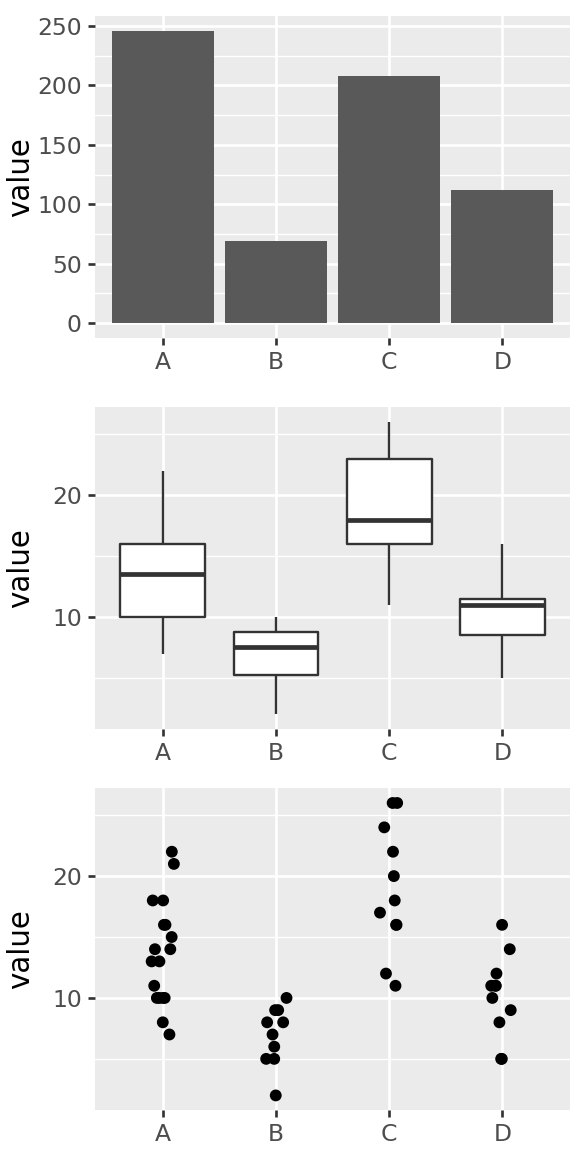
Think about what you want to communicate

How is information conveyed in this chart?
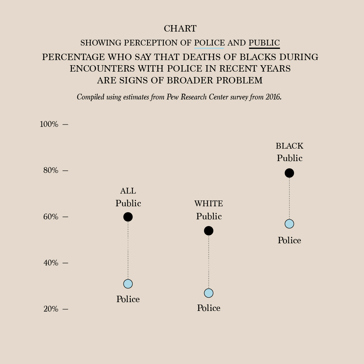
- percentage values are mapped to vertical coordinate
- columns are groups of people
- color of points shows “public” versus “police”
- lines connect ‘public’ and ‘police’ pair in a given group
- length of lines connecting points shows difference between public and police percentages
- labeled ticks on y-axis shows what the values are
- y-axis scale is chosen so vertical distance is proportional to percentage difference
Question: Pros/cons of this plot versus table with 6 numbers?
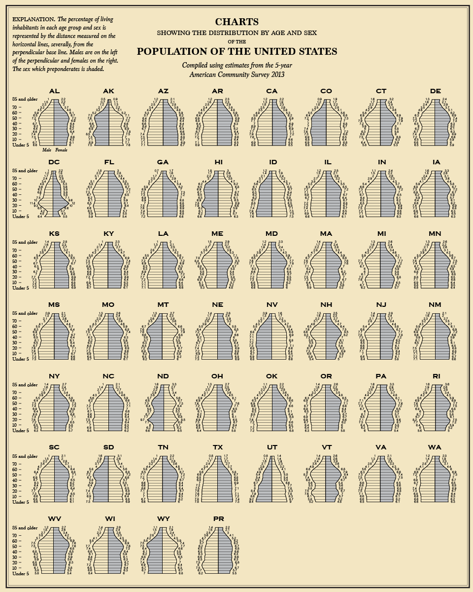
How about this chart?
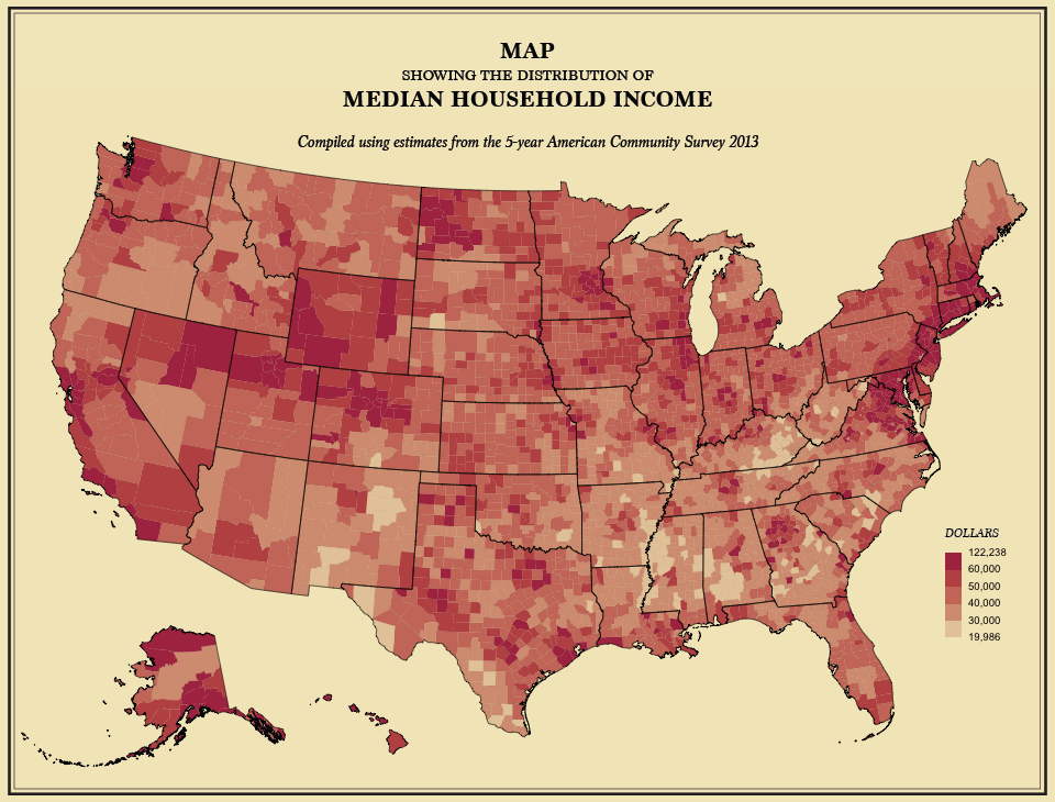
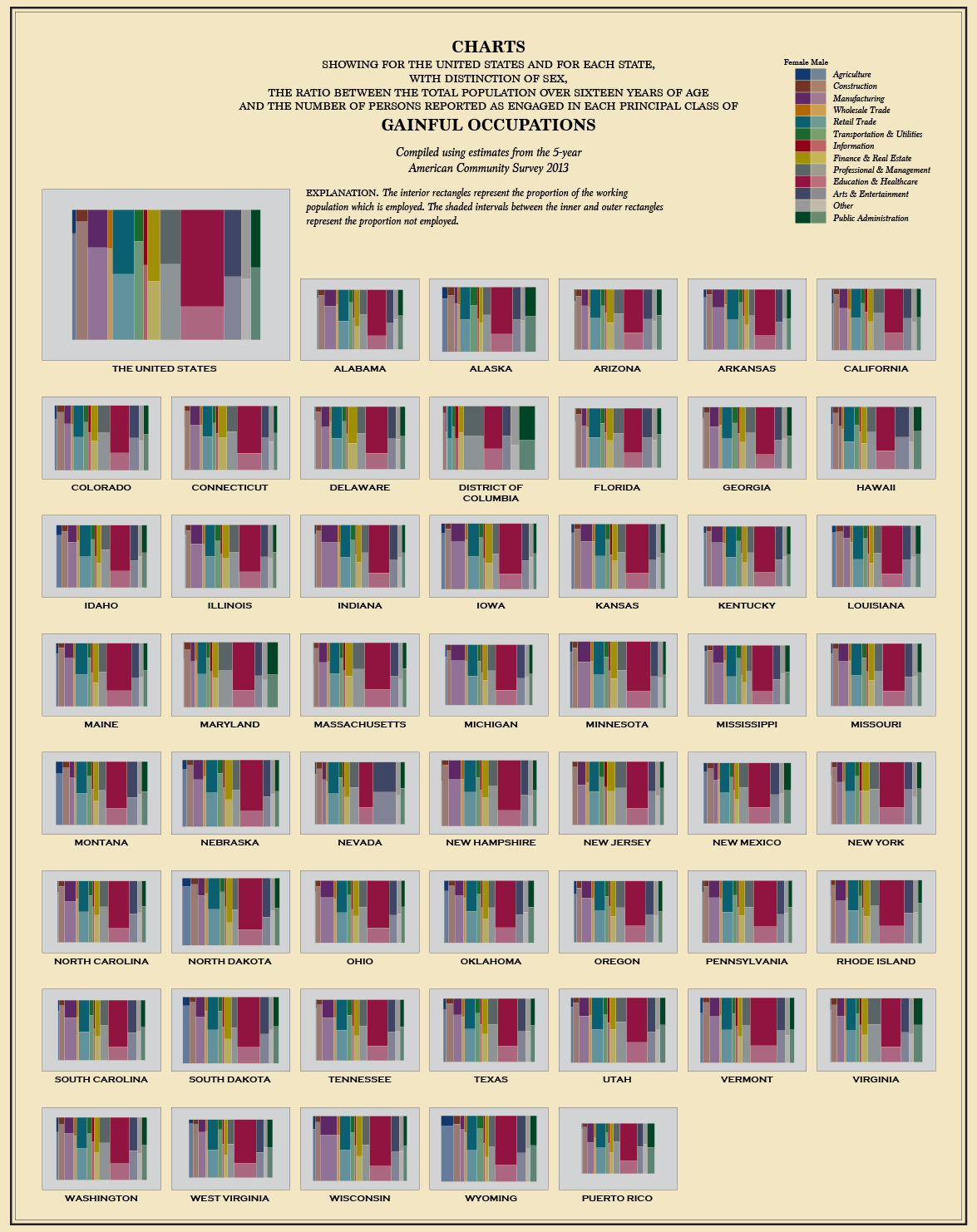
From the 5-year American Community Survey 2013, via flowingdata
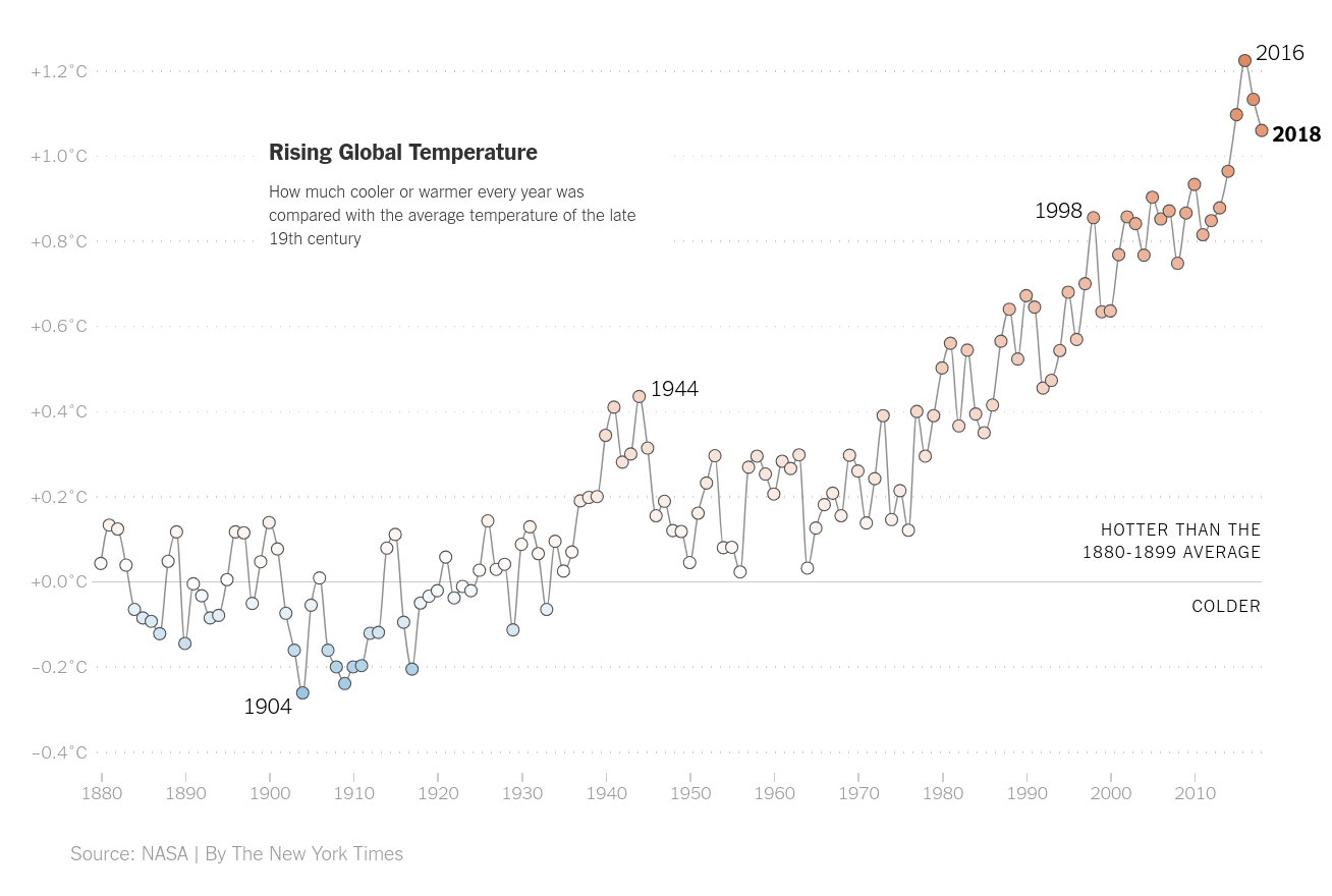
from NYT
From: flowingdata