import numpy as np
import pandas as pd
import plotnine as p9
import glob
import sklearn.decomposition

def make_date(x):
    """
    Makes a datetime object out of the Date and Time columns
    """
    return pd.to_datetime(x['Date'] + " " + x['Time'], format="%Y/%m/%d %I:%M %p")

def compute_precip(x):
    """
    Returns for each entry the amount of precipitation that has accumulated
    in the previous five minutes, inserting NA for any entry for which either:
        - the difference in accumulated precipitation is negative, or
        - the previous entry was not five minutes ago.
    """
    dt = x["Date"].diff().dt.seconds
    dp = np.maximum(0, x['Precip_Accum_mm'].diff()).mask(dt != 300, pd.NA)
    return dp

def read_weather_files(ddir):
    """
    Reads in all CSV files in the directory `ddir`, and returns a concatenated
    data frame. For each file, assumes that file names are of the form
    "something_CODE.csv"; and inserts "CODE into the "code" column of the result
    for that file.
    """
    wfiles = glob.glob(ddir + "/" + "*.csv")
    assert len(wfiles) > 0, "No files found."
    xl = []
    for f in wfiles:
        x = pd.read_csv(f).convert_dtypes()
        x['Date'] = make_date(x)
        x['code'] = f.split("/")[-1].split("_")[0] ## change "/" to "\\" on windows
        x['Precip_Amount_mm'] = compute_precip(x)
        xl.append(x)

    return pd.concat(xl)

weather = read_weather_files("data/weather_data")Exercise: PCA
Some more about the weather
You are by now familiar with the local weather data. Below I have “done PCA on this data”. I would like you to interpret the results.
Concretely: suppose that we have been tasked with understanding on which days ants are likely to be active on counters in Eugene. A myrmecologist suggested that weather probably has a lot to do with it. So, we decided to use the local weather as a predictor. We have ant activity data from houses across Eugene, but it is at a daily level, and we don’t know what variables to use (temperature at noon? pressure at 9pm?) So, we decided to summarize the large number of weather observations using PCA. Then (imagine) we found that higher values of PC3 are strongly associated with more ant activity. What is this telling us about conditions in which ants tend to be active (in this dataset)?
So: read the code, print things out and investigate, and talk through descriptions of the figures.
Questions:
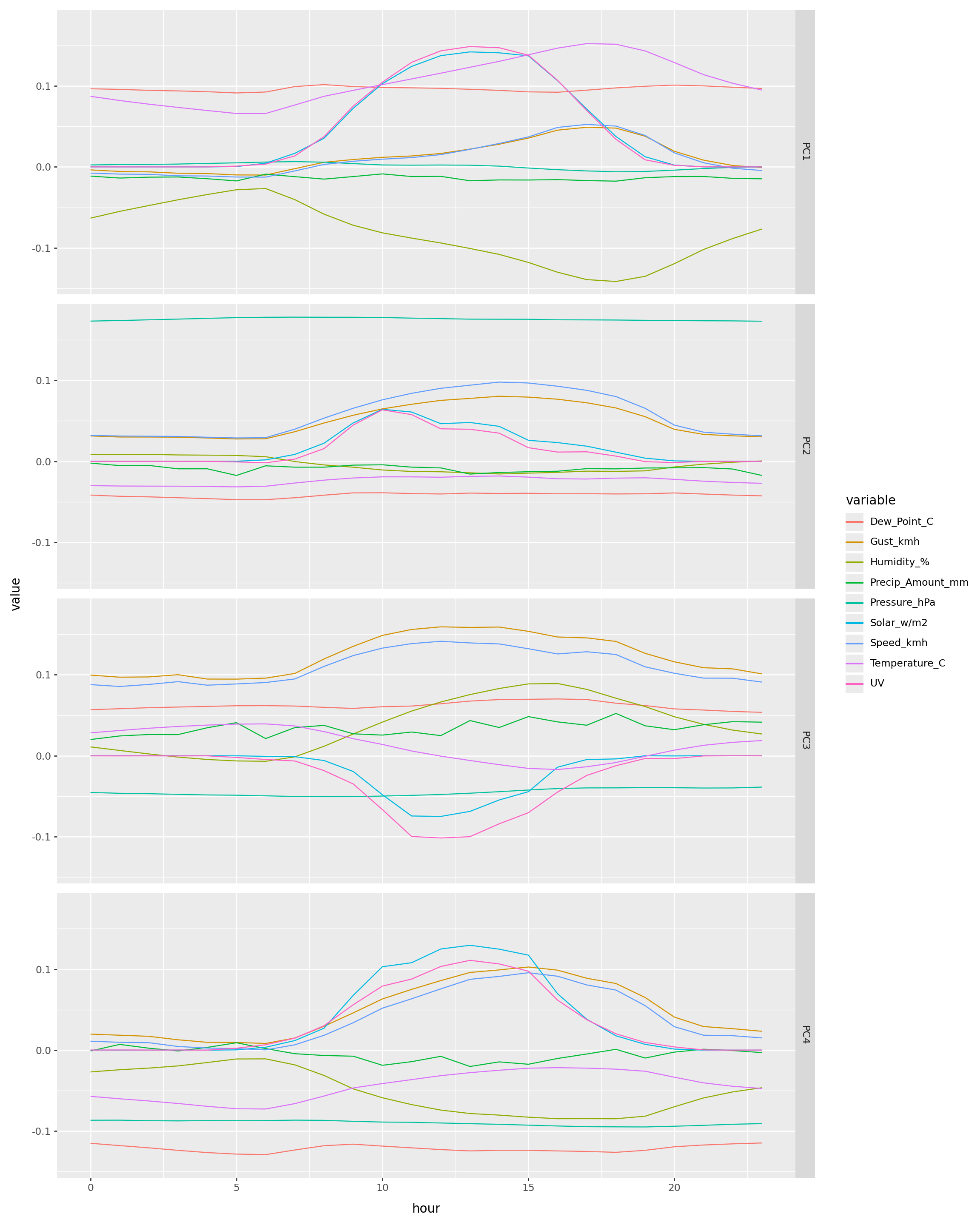
- What does each point in the PCA plots represent?
- What does each line in the loading plots represent?
- Explain in words what differentiates high values from low values on each of the PCs.
Unzip the data and put it in data/weather_data/.
The code
use_cols = ['Temperature_C', 'Dew_Point_C', 'Humidity_%', 'Speed_kmh', 'Gust_kmh', 'Pressure_hPa', 'UV', 'Solar_w/m2', 'Precip_Amount_mm']
w = weather.copy()
for cn in use_cols:
    w[cn] /= w[cn].std()
X = (
    w
    .assign(
        hour=lambda df: df['Date'].dt.hour,
        day=lambda df: df['Date'].dt.dayofyear,
    )
    .pivot_table(
        values=use_cols,
        index=["code", "day"],
        columns=["hour"],
        aggfunc="mean",
    )
).dropna()
pca = sklearn.decomposition.PCA(n_components=4).fit(X)
pcs = pd.concat([
X.index.to_frame().reset_index(drop=True),
pd.DataFrame(
pca.transform(X),
columns=[f"PC{k+1}" for k in range(pca.n_components_)],
)],
axis=1,
)pls = (
pd.DataFrame(pca.components_.T, index=X.columns, columns=[f"PC{k+1}" for k in range(pca.n_components_)])
.reset_index(names=["variable", "hour"])
)(
pcs
>>
p9.ggplot(p9.aes(x='PC1', y="PC2", color="day"))
+ p9.geom_point()
) | (
pcs
>>
p9.ggplot(p9.aes(x='PC3', y="PC4", color="day"))
+ p9.geom_point()
) + p9.theme(figure_size=(15,7))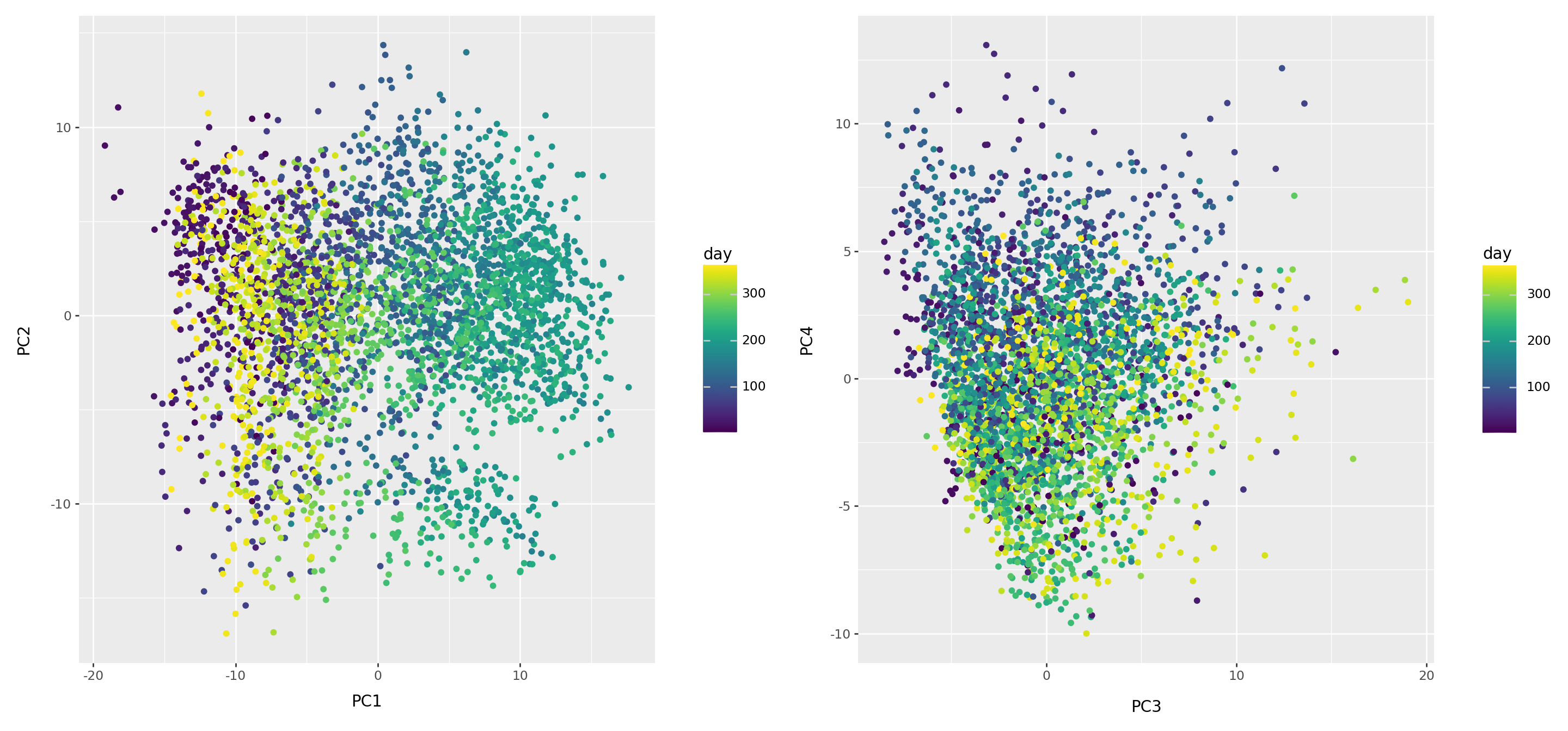
(
    pcs
    >>
    p9.ggplot(p9.aes(x='day', y="PC1", color="code"))
    + p9.geom_line()
) / (
    pcs
    >>
    p9.ggplot(p9.aes(x='day', y="PC2", color="code"))
    + p9.geom_line()
) / (
    pcs
    >>
    p9.ggplot(p9.aes(x='day', y="PC3", color="code"))
    + p9.geom_line()
) / (
    pcs
    >>
    p9.ggplot(p9.aes(x='day', y="PC4", color="code"))
    + p9.geom_line()
) + p9.theme(figure_size=(15,12))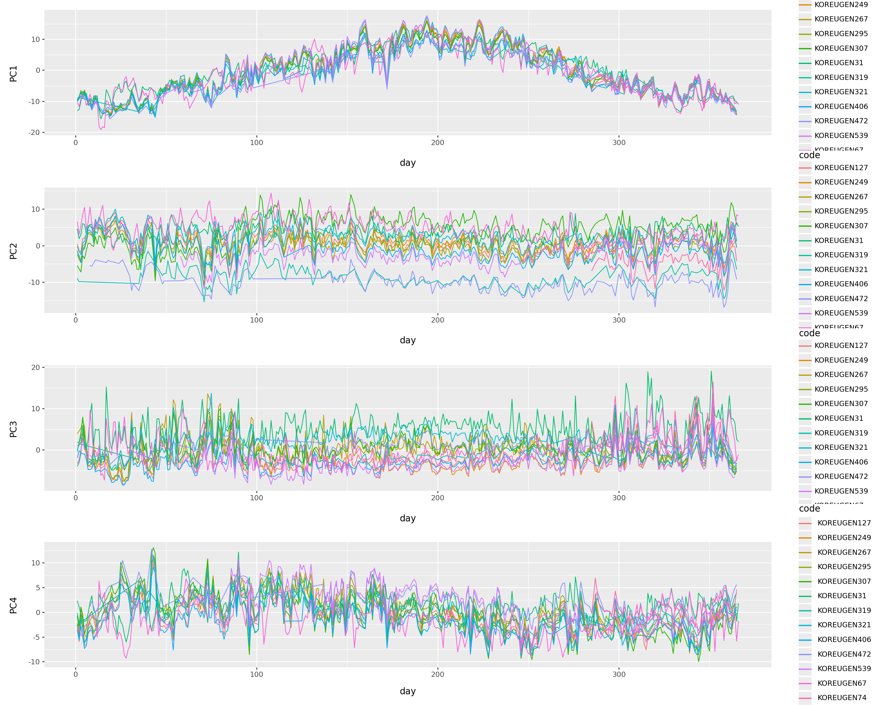
(
    pls
    .melt(id_vars=['variable','hour'], var_name='pc')
    >>
    p9.ggplot(p9.aes(x='hour', y='value', color='variable'))
    + p9.geom_line()
    + p9.facet_grid("pc")
) + p9.theme(figure_size=(12,15))